Based on the success of our first edition of Web Design Suicide, we couldn't help but bring it back for another go around. Spending WAY too much time on the web obviously has its disadvantages - you hurt your eyes, you get out of shape, carpal tunnel sets in, etc - but the benefits of finding websites that simultaneously make you cringe, smile and cry makes it all worth it. Well, at least it does to us.
I'll preface this one more time by pointing out that this is all meant in good humor, and hopefully as a useful critique for the subject, as we feel strongly that a poor website can really harm a business. So please don't get caught up in the semantics, the advice is genuine. (Note that our first subject, Grand Marketing, has since made some beneficial changes to their site. Hopefully we were a catalyst in affecting some of those positive changes. And to them, we tip our cap.) Okay, enough preface. I'm sure you want to know who's next. (Drumroll).
Bon Scott!

Okay, it's not actually Bon Scott. But if you recall his story, the former AC/DC frontman met his end after too much to drink and ultimately asphyxiating himself on his own vomit. Not a great way to go I'm sure. That said, the lesson to learn here is try not to kill yourself via vomiting. Today's subject may not have taken note of this lesson.
1seomichigan.com - You have been chopped.

Sins
- Building this website on purpose.
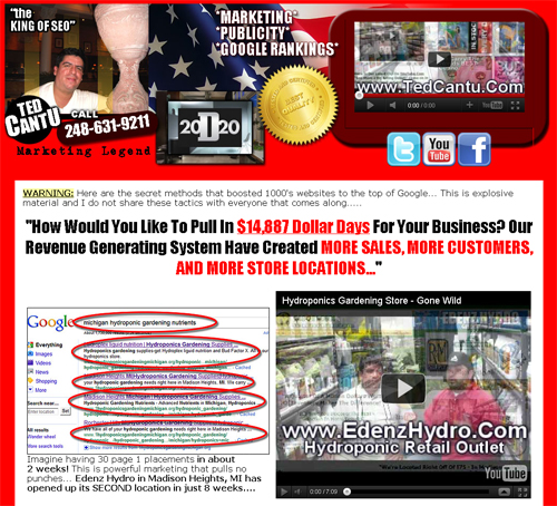
- Okay, more specifically, the point of a lead generation website is to generate leads. With the immense amount of clutter puked upon the page, it's pretty easy to miss the only point of contact, the phone number, which stands out about as much as Waldo in a pile of candy canes. Timothy Ash would roll over in his grave if he saw this website.
- Everything is on one page. 2,995 words on a single page! This, my friends, is overkill. If you just want to send an email you need to scroll three quarters of the way down the page to find out how to do this. You want to make it EASY for someone to business with you, and making someone grab a rope and rappel from a 3,000 foot cliff to find your email is the antithesis of easy.
- TOO MUCH RED. This site feels like you're wading through a field of the dead during a scene in Braveheart. Red to the right, red to the left, bolded red text, red circles highlighting things you are supposed to be paying attention to. The problem with this, unfortunately, is that there's so much red that it stops being a point of emphasis. There's simply no direction to the design of this page in terms of layout, content or color scheme. Again, it would appear that things were, for the lack of a better term, vomited all over the page. I'm sure this is not what the goal was, but it's likely that this page was built and just kept expanding over time into the sprawl it has turned into.
- And not to nitpick, but one of my pet peeves with SEO companies is when they tout results that really don't matter. Case in point, the first example on the page shows top results for "michigan hydroponic gardening nutrients". While that looks nice, please go to the Google Keyword Tool and type in that phrase for the monthly estimated search volume. You'll find it's zero. I'm not even saying these guys CAN'T get results, but show people something tangible. I'd bet a couple of dollars that if I were to write a blog post next week titled "michigan hydroponic gardening nutrients" that it would AT LEAST rank in the top three. It's not a competitive term and any site with some decent authority can build a page to rank for such a term.
Free Advice Time
- Consolidate. This guy obviously has some happy customers, but there's too much and they're not organized. Adding a couple short quotes and clients on the home page would probably be enough to establish credibility. Creating an organized page of success stories/testimonials could help a visitor identify a similar business in a similar situation which would certainly help sell.
- Expand. This seems contradictory, but it builds off the first point. The navigation needs to be expanded. 3,000 words moving back and forth between the services you provide, testimonials, and credibility building can be tedious and confusing. Making a page that talks about the specifics of the service(s) offered, along with a page about the company and some success stories breaks things up and gives a visitor an easy way to move between the basic pieces of information they likely want to see.
- As someone with some video expertise I feel safe saying the videos themselves could use some work. The biggest flaw? The audio. Adding some microphones would add a significant amount of professionalism to the videos which are so prominent throughout this page/site.
- Show some good examples! The rankings examples shown throughout the site are for pretty extreme long tail terms with little or no traffic. If you want to win over some more discerning clients, show them how you ranked in the top three for a term that gets searched a few thousand times per month. THAT will show some real SEO expertise.
- Make CLEAR calls to action. Calming down the color scheme and making points of contact (phone number/contact form/email address) above the fold and painfully obvious in terms of their design will improve the likelihood of conversion as a visitor moves through the site.
The Takeaway
- Puke killed Bon Scott. Don't puke on your website, or your business might end up pushing daisies as well, long before you've had time to build a Rock n' Roll Hall of Fame caliber career. Don't be that guy/girl.